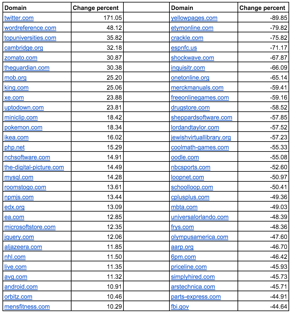
In the USA, mobilegeddon was much more successful in making website operators take note of Google’s mobile-friendly update than for any other country we looked at.
For the European search-markets, the worst mistake we found was companies not having a mobile-friendly version of their site.
In the USA, many website operators just made sure their homepages, and maybe a few content pages, were mobile-friendly. Thanks to the nature of the mobile-friendly update, which is considered on a URL by URL basis, these domains will still lose visibility on all non-mobile-friendly pages. This far from an ideal solution.
The website for Universal Studios Orlando is an example of ‘partially mobile optimised pages’. This causes the mobile visibility for the domain to be 48% less than the desktop visibility.
The domain is ranking for 2,450 top 100 keywords for the desktop search and 1,501 top 100 keywords for mobile, a 40% loss between the two. The Top 10 does not look much better, with a 36% difference.
Here we see the results of a ‘site:universalorlando.com’ query on a smartphone. A few of the results show the ‘Mobile-friendly’ badge, while many others are missing this mention.
There are a number of large domains with a similar problem. Some examples are Kayak.com (-31%), NBCsports.com (-53%) , NYC.gov (-35%), Kmart.com (-35%), Kohls.com (-35%), Remax.com (-40%), Census.gov (-43%), Priceline.com (-46%), 6pm.com (-46%) and Hotels.com (-38%).
Anytime someone loses their ranking, someone else will pick it up. Which leads us directly to the sites that came out on top after ‘mobilegeddon’.
Winners
1) Twitter.com
Twitter.com has the largest gain in mobile visibility. It ranks for 271,529 top 100 keywords for a desktop search and 266,587 keywords for mobile searches. Twitter manages to take this small difference of 1.5% in the top 100 keywords and turn it into an increase of 171% in visibility for mobile over desktop.
Twitter ranks for 92% more top 10 keywords on mobile than on desktop-searches.
Clearly partnering with Google and allowing its tweets to be indexed has led to this triumph.
2) Wordreference.com and 4) Cambridge.org
The English-Spanish dictionary Wordreference.com from Florida managed 28 total points more in its mobile-visibility than for desktop, which comes from having nearly 1,000 more mobile keywords in the top 10 than for a desktop search.
The British dictionary Cambridge.org also manages to make more out of its mobile visibility, at an increase of 43 total visibility points.
Two possible sources for this visibility increase may be the heavyweights Merriam-webster.com (-68 points for mobile vs. desktop) and Dictionary.reference.com (-74,66 points for mobile vs. desktop).
Here it is important to note that both of these domains are doing a good job overall, they just have a noticeable gap between their desktop and mobile visibility.
6) theguardian.com
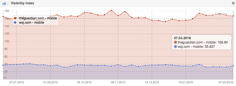
One domain that stands out on our list of winning domains is theguardian.com. The British newspaper managed to gain 40 points in its mobile visibility, going from 130 points for desktop to 169 points for mobile.
Just to give you a feel for this number, WSJ.com has about 35 points of mobile visibility in total. Theguardian.com really rocks its mobile visibility.
10) Uptodown.com
This international download site from Spain shows an increase of 23% between its mobile and desktop visibility.
This case is interesting because the publisher allowed us access to their analytics data for the USA. The Spanish domain manages to gather 5.5 million users from the USA each month, of which 76% are mobile users, with a year-over-year increase of 132%.
Losers
1) Yellowpages.com
This well known site has a large discrepancy between its mobile and desktop visibility. Yellowpages.com has lost 90% of its visibility. The reason for this decrease is the simple fact that the mobile version for Yellowpages.com is hosted on the domain yp.com.
If we look at the difference between these two domains, the mobile-version still only has about 26 points of visibility, where the desktop-version has a visibility score of about 45. Therefore, Yellowpages.com has lost 43% between its mobile vs. desktop visibility.
2) Etymoline.com
Etymoline.com managed to lose 50% of its keyword rankings between desktop and mobile searches. The loss in the top 10 is even more pronounced at 80%. This is happening because it does not have a mobile version. It also lost 72% of its mobile visibility on Google.co.uk.
3) Crackle.com
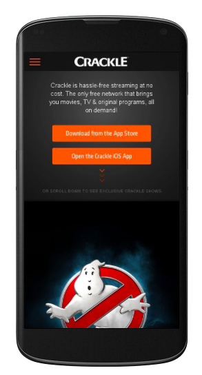
Showing interstitials on your mobile pages, where overlay ads take up most of the space on the page, is a very common mistake. Google even released a study on the negative impact of interstitials on search-behaviour, which showed that 70% of users abandoned mobile pages with interstitials.
Crackle.com, for example, has a 76% lower visibility for mobile thanks to its use of interstitials. In this case, it’s interesting to note that the domain ranks for nearly the same number of keywords on mobile and desktop. It just ranks worse for the mobile keywords.
4) ESPNfc.us
This domain already showed up in our article about which US sites lost the most amount of Google visibility in 2015. It’s using both canonicals and hreflang markup together on its site and the following chart shows how both versions cannibalise each other.
8) Merckmanuals.com
A similar problem can be observed with Merckmanuals.com, where this domain is cannibalised by Msdmanuals.com, which was on our mobilegeddon winners list for the UK.
Both domains rank in the US market and use a rel=”canonical” together with a rel=”alternate” markup.
5) Schockwave.com and 14) Coolmath-games.com
If a specific page is not available it should return a status code 404 (page not found) instead of just redirecting the user to the home page, regardless of the desktop or mobile version. All these redirects to the home page constitute soft-404 errors, which have a negative impact on the site.
Shockwave.com (-68%) and Coolmath-games.com (-55%), for example, redirect many of its pages which are not optimized for mobile use – because many of its products use Adobe Flash – to its mobile home page.
6) Inquisitr.com and 12) Lordantaylor.com
Lastly, we have those domains that look as though they are mobile-friendly, but which are not. Two examples are inquisitr.com (-66%) and lordandtaylor.com (-57%).
Conclusion
You have three ways to take care of this:
1) You can either use responsive design, which will show the same source code on the same URL for both desktop and mobile users and scale the site accordingly – this is what Google recommends you to use. In addition to this, not one of the losers on our list use responsive design.
2) Next you can use ‘dynamic serving’, where you stay on the same URL but make the server return a different HTML source-code depending on the device opening the page.
3) Finally, you can use a separate URL, be it on a subdomain (for example m.example.com) or a different domain altogether (as is the case for Yp.com and Yellowpages.com). For this option, the server needs to consider a lot of different factors: devices, resolution, models of devices, etc. and Google could have problems to understand all these set-ups.
Examples of where this causes problems can be seen with FBI.gov (-45%), Mbta.com (-50%), as well as Huffingtonpost.com and Huffpost.com, where both versions rank on the Google US search results. It only works well as long as the two versions are set-up correctly:


No comments:
Post a Comment