Thursday, March 31, 2016

Dictionary of ad buying: key terms and acronyms

For beginners, buying ads can be a confusing labyrinth of jargon and acronyms. To help you make sense of them, we've compiled this helpful glossary.


If you're new to buying ads, you may not know where to begin. There are a lot of terms; some, like targeting, are fairly obvious, while others just seem like an alphabet soup of acronyms. If you're like, “AMP, CPC, DSP, what?” fear not. We're here to help.


We've separated this glossary into three categories:


  • Before – where we define the different kinds of ads.

  • During – is about the terms you'll come across while in the purchasing stage, such as “ad exchange,” which is very different from an “ad network.” 

  • After – breaks down some of the things that happen once your ad has made its way to the Internet.


First, let's go back to the beginning.


Before


The first thing you should know is the difference between the various kinds of ads you may be buying. In case you missed our beginner's guide to display advertising, here's a brief refresher.


Display ad: ads on webpages that are obviously advertising. Display ads are measured in pixels – picture elements, or the dots that make up pictures – and come in several forms. There are the rectangles and squares we're not going to bother defining because we're confident you've been to first grade, as well as a few others whose names aren't so self-explanatory.


  • Banner ad: The horizontally long, vertically short ads most commonly placed at the top (leaderboards) or bottom of the page. According to Google, the ones that perform best are 728×90 and 320×110. Banners can also take a more tall, narrow form in skyscraper ads, which run alongside the page.

  • Billboard: similar to banner ads, but a bit taller. With that extra height, billboards better lend themselves to text.

  • Button: a small display ad. Common sizes are 120×90 or 125×125.


Native ads: native ads are designed to blend in with their surroundings, as commonly seen on Yahoo's digital magazines.


yahoo-music-nativeads


Pop-ups: ads that pop up in a new window. They can also appear underneath your window, so as not to be disruptive (pop-unders) or in between activities (interstitial). Another form of pop-ups ads are the overlays, which close on their own after 15 to 30 seconds.


Responsive ads: ads designed to adapt to different devices and screen sizes.


Rich media: ads with audio, video, or some other interactive element.


During


Now you know the kind of ads you can buy. Here are some terms from the next stage: actually buying them.


Ad exchange: a technology platform that enables advertisers and publishers to buy and sell advertising space. AOL's Marketplace, Google's DoubleClick and Microsoft are a few of the big ones.


Ad network: companies that connect advertisers with the websites that want to host their ads. Networks vary based on transparency regarding where the ads will run (vertical networks are transparent, while blind networks are not), whether the advertiser is looking to reach a specific demographic, and formats, such as mobile and video.


Ad serving: the technology and services that place ads on webpages:  providing the software, counting them, deciding which ads will be the most profitable, and ultimately tracking the ads' performance.


Ad verification: a system ensuring that an ad is a good one, from a quality standpoint.


Auction: the process that determines who sees ads, and when and where they see them on a page. In Google's AdSense auction, for example, advertisers determine the maximum amount they're willing to pay for an impression, and the winner is chosen based on a combination of targeting, format, and Quality Score. That determines how useful someone is likely to find an ad, taking into consideration its relevance, keywords and predicted click-through rate (CTR). This can be done instantly, on a per-impression basis, known as real-time bidding (RTB).


Audience buying: Using data to target specific groups of consumers.


Cost per click (CPC): how much an advertiser earns each time someone clicks on one of their ads.


Cost per mille (CPM): a unit of measurement that refers to the price of advertising. The name can be confusing; “mille” is the Latin word for 1,000, and doesn't mean 1 million.


Data aggregation: the practice of pulling together different kinds of data – ad-serving, conversion, third-party – without attaching anyone's personal information.


Demand-side platform (DSP): the technology that allows advertisers to purchase ads automatically via real-time bidding exchanges. The publisher version of this is known as a supply-side platform (SSP).


Dynamic creative: segment-based advertising that changes automatically, depending on who's seeing it.


Inventory: the number of ads or the amount of space a publisher has available to sell.


Management platform: audience management platforms (AMP) automate the process of segmentation, while a data management platform (DMP) serves as a one-stop shop for all of an advertiser's data.


Programmatic buying: an automated way to purchase ad inventory. This is a particularly hot topic now, as agencies beef up their programmatic capabilities.


After


You've purchased your ads. Here are some helpful terms for what comes next.


Ad blockers: browser-enabled software users use in order to avoid seeing ads.


Ad fraud: the practice of serving ads that will never be seen by human eyes, in order to illegally profit off the clicks.


Banner blindness: the idea that there users see so many banner ads that they don't even notice them.


Conversion: when a clicks leads to something valuable for the advertiser, such as a purchase, sign-up or pageview.


Cookie: small files passed from a web server to a browser, allowing advertisers to track people throughout the internet.


Frequency capping: a restriction limiting the number of times someone will see the same ad.


Impression: the measure of ad views.


Viewability: a metric regarding ads actually being seen by people. The current rate is inadequate, according to senior leadership from the Interactive Advertising Bureau (IAB) and Media Ratings Council (MRC).


This article was originally published on our sister site ClickZ.
Wednesday, March 30, 2016

How to use In-Page Analytics and how it can help boost conversions

Google Analytics is most certainly complex, so naturally there are a few options and features that go unnoticed.


So where do you begin if you're trying to get more advanced and need a place to start? In-Page Analytics is probably one of the most under-used features that can also be the most impactful to a small business.


By looking at these specific analytics you can figure out which areas of your site are most important and which links visitors are clicking when they are actually on your site.


Once you can understand some of the details associated with user patterns, you can reformat your site and optimize in ways that ultimately will boost your conversions.


How to access your In-Page Analytics


The purpose of In-Page Analytics is to be able to tell what is working visually and what is not. In order to see your In-Page Analytics data you will need to sign into your Google Analytics account. Before you can do anything specific with the report, you will have to enter the URL for the page on which you want the report to launch. You enter that URL when you edit the settings for a Reporting view.


You can access this report two ways:


  • Access-Way #1

  • Sign in to your Analytics account.

  • Navigate to your view.

  • Select the Reporting tab.

  • Select Behavior > In-Page Analytics.

  • Access-Way #2

  • Select Behavior > Site Content > All Pages.

  • Drill into a page and select the In-Page tab.

  • This opens the report for that page.


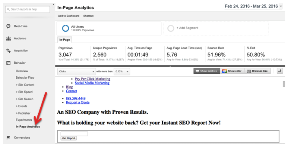
In both cases you access the report through the 'behavior' section. Once, you click on In-Page Analytics, your website's home page will display the exact percentage of where users are clicking on your site. Below shows where you can find the In-Page Analytics report and what it looks like:


in-page analytics


Once again, the job of the In-Page Analytics report is ultimately to infer the number of clicks on a page element (CTA, links, etc.) from the number of times that page appears as the referrer to subsequent pages.


In this way you can see which elements are leading to the more popular subsequent pages on your website. In many cases this is not just a preference of content, but something that stood out more than other elements on your website.


Customizing In-Page Analytics


According to Site Pro News, you can also customize in-page analytics for the needs of your site, which Site Pro News also touched on here. This can directly help to optimize your site, which in turn will help boost conversions.


Here are two ideas for how you can customize the report:


Importance of setting the date range


Just as with any report, you may customize your date range by clicking on the date panel located on the top right-hand side of your analytics dashboard and choosing your own date range.


This will allow you to understand exactly what was up on your site or any changes you have made, and when. Periods of time are incredibly important to consider with this analysis, so I recommend clicking the 'Compare To' button to see if you're making improvements:


setting date range


Keep in mind that the only way to say whether or not your numbers are 'good' or 'bad' is to compare them to what they were in previous months, and this is especially true with this report.


Every website is different, so you're in a competition with yourself first and foremost before worrying about competition.


Using Segmentation


There are a lot ways to segment your data on the in-page analytics platform. This will allow you to look at how users arrive on your site (for example) and then the ways that they navigate it once they are there.


You can separate, as the screen shot indicates, by categories such as 'made a purchase', 'referral traffic', 'direct traffic', or 'new users'. All of this can be used to optimize your site and figure out what focus you need to have to boost conversion rates.


To create a segment, click on All Users. This will take you to a screen where you can 'Add a Segment' (as shown below). You can then click to create a recommended segment or create a custom one. The screenshot below, for example, has segments for Bounced Sessions, Direct Traffic, and Converters. Just hit 'Apply' at the bottom when you're finished.


add segment


Note: If you're new to segmentation, segmenting your email lists is probably one of the easiest and most important places to start. Check out this article to learn more.


Making the Most of In-Page Analytics for Conversion Rates


Just as we discussed above in the section on data customization, there are a lot of different ways to make the most of your data to enhance your conversion rates. Segmenting data is one of the more successful ways to focus on who is finding your site and how these differences might effect interaction.


If you are interested, check this out this video on the visual context for your In-Page Analytics data from Google…


So now that you know how to read the data and what to look for, it's important to understand how exactly to customize it. Below are some tips on customization that will help you make the most of your data for conversion rates:


  • Make sure you segment or have a category for each of the streams/referral sites that people may be coming from-whether it be social media or other sites.

  • For each channel, you want to construct a separate report (this includes direct traffic as well). This will give a clearer picture of the differences in where your audiences are coming from.

  • Make adjustments as you see fit. For example, if you have a CTA that is either not being clicked, or people are leaving your site once they do, then you probably need to readjust and reconfigure the way this particular element is presented. There may also be differences for certain audiences that you want to account for, but remember to prioritize places where you are getting the most traffic from.

  • Find out where maximum click happens. For example, if it happens on the top left side of the page, then put your conversion links there. Always check this when you run your analysis and make sure you adjust accordingly, as this can change over time.

  • Make efforts to reduce whenever exit rate is high, especially when it is on most-linked or top pages on your site.

  • Make it a goal to check back on a regular basis, as you do with your other analytics, so you are conscious of what needs to be adjusted over time


The Takeaway


It is difficult to understand why In-Page Analytics are as underused as they are when they provide such valuable insight. Definitely do not miss out on the opportunity to look at this as a tool of change and boosting conversion rates. The ability to segment your visitors and see how they interact with your site is very valuable; so start now!


Do you have experience with Google's In-Page Analytics? Let us know in the comments section below, we would love to hear from you.

Tuesday, March 29, 2016

Three early results of Google removing right-hand side ads

About a month ago, Google introduced what now seems like a very obvious change to its results pages: it removed paid search ads from the right-hand side.


Apparently Google made this change based on years of testing. These tests showed that no one was really clicking on these ads and it would better align with the mobile experience if they simply weren't there.


The impact of this means there will be less inventory, and ranking at the top of the page is potentially even more important than ever before.


So now that we are a few weeks into this change what is the impact? Did everything the industry predicted come true?


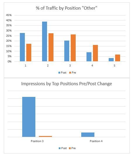
To understand the impact I ran a keyword level report that included the Top vs. Other segment, looking at three weeks post and prior to the change.


There are three things to note:


1) Inventory is down


As expected, with no more ads on the right-hand rail there are less ad spots available. As a result we are seeing a 19% decrease in total inventory. The majority of that reduction is within the Other bucket.


impression changes


2) Traffic shifts


You can see from the data below that traffic for positions below the organic listings has shifted up significantly and dropped in lower positions due to inventory restrictions. You also see an increase in traffic to positions 3 & 4 in the Top ads. While the increase is still noticeable, it is still <5% of total traffic in the post-right-hand-side-ad world. This implies that either we don't manage a lot of brands that have 'highly commercial' queries or that the impact of adding a 4th position is still pretty small.


traffic by position other


3) Despite these changes CTRs and CPCs are down


The fact that click-through rates are up isn't that big of a surprise given the fact that more ads are seen by searchers, so you would expect more click-throughs to occur. What is really good news for advertisers is the fact that consumers are responding well to the new layout of the page: CTR is up {12%) and CPCs are down (-11%). Hopefully this will help overcome the reduction in overall inventory.


post right rail changes


So what does it all mean?


This is a big change that seems to be having the expected impact of reducing total inventory, but increasing the amount of traffic as a percent of total impressions.


Advertisers need to be taking a look at their own data. Are they seeing different data? Are CPCs going up in certain areas given competition? Is the incremental CPC worth it to your business, or does the reduction in CPC allow you to spend more in other areas?


Staying close to your Top vs Other data segments and detailed data points will allow you to respond to this change in a smart and sophisticated way.

Monday, March 28, 2016

Digital transformation: are you asking the right questions?

Twitter turned 10 last week. This post isn’t about Twitter, but it made me realise how long I’d been working in the social media field (it’ll be nine years next week).


I’m reasonably convinced I got my first social role because I just happened to be doing social when the whole thing became popular. This happens a lot in marketing. Something new comes along and we all hop on board, until everyone is doing it and it’s gradually subsumed by another area of marketing. In Twitter’s case a slightly wonky mix of PR and CRM.


Digital transformation is probably the biggest of those ‘new, shiny things’ to hit the marketing world in the past five years, and it’s unusual in that it actually attempts to connect marketing up with other parts of the business.


It has become the teenage sex of the digital world; Everyone is talking about it, but you’re never quite sure how far anyone has really gone. Hundreds of articles and whitepapers now exist (I wrote a few of them myself), focused on the three key areas of DT: people, processes and technology.


As with social media though, there comes a point when people start to realise that, hey, maybe we should have a clear goal in mind here?


A great deal of resource is being put into transformation projects, some are successful, but in a lot of cases they are slightly disjointed. Getting the new tech is probably the easiest part. Putting the new processes in is time-consuming but can be done with regular training and a step-change approach.


The people part is probably most difficult, because it not only requires new skills, but often a cultural change as well.


And here’s the rub. The differentiation that makes companies into successful digital enterprises.


As an example, let’s have a look at Barclays.


Barclays_Pingit


Image via VisMedia


Barclays has invested heavily in digital, with a multichannel and multi-platform approach. And just so you know this isn’t me slighting the company, it has done a very good job. I can now easily access my finances via any device; I rarely need to visit a branch. I no longer receive paper updates, and I can easily send payments directly from my phone. Services and resources are delivered successfully in a variety of formats.


But there is a gap. And in the case of financial services it has allowed a new wave of digital-first fintech enterprises to fill a gap in the market.


Companies like ZhongAn, Wealthfront, Klarna and Ebury. All have something in common. They all offer fast, tailored solutions. And tailoring means you are forced to really dig into your available customer data, and act on it quickly.


Traditional business structures exist for a reason. They allow any given business to deliver its services to the customer in at least a semi-acceptable fashion. But too often when we approach digital transformation, our goals are to expand on existing business, rather than exploit new opportunities.


We are using digital to deliver our services in a more efficient way, but that doesn’t mean the services themselves are actually better.


Customer-centricity is a term that gets bandied around a lot, and personally I believe it’s largely a result of culture. Actually caring about what you are doing and what people think of it goes a long way. And that isn’t to say that businesses attempting to transform themselves don’t care. Only that their focus is often on the wrong thing.


Size has something to do with this. Start-ups in particular do have certain luxuries available to them. If I start a business then I can, within reason, cherry-pick the exact tools I want to run my business, and hire the people I feel are the best fit to help me run it. People who already have ideal skill-sets. But much of this can be offset by investment, so it has to come down to attitude.


According to Cisco research, some 45% of businesses have boards that are not concerned with digital disruption.


In finance in particular this seems to be compounded. Research suggests that a majority of senior banking execs have not even heard of the biggest fintech startups, let alone become concerned about them.


In short, they see no reason to change.


But the startups of this world know that they are no longer dealing with single-channel audiences who insist on having their emails printed out. Services need to be delivered easily across multiple interfaces, in line with customer intent. They have to find out what a new type of customer wants, and give it to them quickly.


Conversely, they also have the luxury of time. If you are starting from scratch, then there’s plenty of room to prototype products, test them, launch MVPs and reiterate.


Businesses that are dealing with an existing model have none of this. They have busy people who are already struggling with deadlines. Who has time to take a step back and really think about how services are delivered? This becomes compounded where there’s a focus on short-term bottom line. It takes a rare individual to stand in front of the board and say with confidence: We are going to lose money for the next six months. But after that our income will increase dramatically.


This kind of leadership seems to be sadly lacking in many sectors, but there is evidence that things are changing. The best digital leaders tend to have a few common traits and chief among them is the being able to see value in unexplored areas.


A few years ago I had a conversation where I was told vociferously that Twitter could not make any money for my business. Because there is nowhere to input credit card details on Twitter. That’s an extreme case, and I hope, one that’s changed (Incidentally, Twitter brought in just shy of a million pounds in that particular year) as these new types of business leader have come to prominence.


It doesn’t always involve the type of full pivot that many startups take. I do not expect Barclays to turn into Uber at any point, but it does involve really understanding customer feedback at speed, and at scale.


There are so many factors in play here that this is threatening to turn into a novel already, but I think the key consideration here is that when implementing new processes, tools – and yes, people – it should all be done with one eye on the customer. Data and anecdotal evidence from user tests should be constantly collected and used.


Digital transformation is about making your business fit for purpose so whether you are setting goals or already implementing, don’t be afraid to start afresh. Digital should improve your services, but first ask yourself: Are these the services my customer really needs?


This article was originally published on our sister site ClickZ. We’re republishing a handful of their recent articles over the Bank Holiday weekend. Go give them some love.


Want to know more about the challenges and benefits of digital transformation? Make sure you check out Shift, our new event in London this May.

Digital transformation: are you asking the right questions?

Twitter turned 10 last week. This post isn’t about Twitter, but it made me realise how long I’d been working in the social media field (it’ll be nine years next week).


I’m reasonably convinced I got my first social role because I just happened to be doing social when the whole thing became popular. This happens a lot in marketing. Something new comes along and we all hop on board, until everyone is doing it and it’s gradually subsumed by another area of marketing. In Twitter’s case a slightly wonky mix of PR and CRM.


Digital transformation is probably the biggest of those ‘new, shiny things’ to hit the marketing world in the past five years, and it’s unusual in that it actually attempts to connect marketing up with other parts of the business.


It has become the teenage sex of the digital world; Everyone is talking about it, but you’re never quite sure how far anyone has really gone. Hundreds of articles and whitepapers now exist (I wrote a few of them myself), focused on the three key areas of DT: people, processes and technology.


As with social media though, there comes a point when people start to realise that, hey, maybe we should have a clear goal in mind here?


A great deal of resource is being put into transformation projects, some are successful, but in a lot of cases they are slightly disjointed. Getting the new tech is probably the easiest part. Putting the new processes in is time-consuming but can be done with regular training and a step-change approach.


The people part is probably most difficult, because it not only requires new skills, but often a cultural change as well.


And here’s the rub. The differentiation that makes companies into successful digital enterprises.


As an example, let’s have a look at Barclays.


Barclays_Pingit


Image via VisMedia


Barclays has invested heavily in digital, with a multichannel and multi-platform approach. And just so you know this isn’t me slighting the company, it has done a very good job. I can now easily access my finances via any device; I rarely need to visit a branch. I no longer receive paper updates, and I can easily send payments directly from my phone. Services and resources are delivered successfully in a variety of formats.


But there is a gap. And in the case of financial services it has allowed a new wave of digital-first fintech enterprises to fill a gap in the market.


Companies like ZhongAn, Wealthfront, Klarna and Ebury. All have something in common. They all offer fast, tailored solutions. And tailoring means you are forced to really dig into your available customer data, and act on it quickly.


Traditional business structures exist for a reason. They allow any given business to deliver its services to the customer in at least a semi-acceptable fashion. But too often when we approach digital transformation, our goals are to expand on existing business, rather than exploit new opportunities.


We are using digital to deliver our services in a more efficient way, but that doesn’t mean the services themselves are actually better.


Customer-centricity is a term that gets bandied around a lot, and personally I believe it’s largely a result of culture. Actually caring about what you are doing and what people think of it goes a long way. And that isn’t to say that businesses attempting to transform themselves don’t care. Only that their focus is often on the wrong thing.


Size has something to do with this. Start-ups in particular do have certain luxuries available to them. If I start a business then I can, within reason, cherry-pick the exact tools I want to run my business, and hire the people I feel are the best fit to help me run it. People who already have ideal skill-sets. But much of this can be offset by investment, so it has to come down to attitude.


According to Cisco research, some 45% of businesses have boards that are not concerned with digital disruption.


In finance in particular this seems to be compounded. Research suggests that a majority of senior banking execs have not even heard of the biggest fintech startups, let alone become concerned about them.


In short, they see no reason to change.


But the startups of this world know that they are no longer dealing with single-channel audiences who insist on having their emails printed out. Services need to be delivered easily across multiple interfaces, in line with customer intent. They have to find out what a new type of customer wants, and give it to them quickly.


Conversely, they also have the luxury of time. If you are starting from scratch, then there’s plenty of room to prototype products, test them, launch MVPs and reiterate.


Businesses that are dealing with an existing model have none of this. They have busy people who are already struggling with deadlines. Who has time to take a step back and really think about how services are delivered? This becomes compounded where there’s a focus on short-term bottom line. It takes a rare individual to stand in front of the board and say with confidence: We are going to lose money for the next six months. But after that our income will increase dramatically.


This kind of leadership seems to be sadly lacking in many sectors, but there is evidence that things are changing. The best digital leaders tend to have a few common traits and chief among them is the being able to see value in unexplored areas.


A few years ago I had a conversation where I was told vociferously that Twitter could not make any money for my business. Because there is nowhere to input credit card details on Twitter. That’s an extreme case, and I hope, one that’s changed (Incidentally, Twitter brought in just shy of a million pounds in that particular year) as these new types of business leader have come to prominence.


It doesn’t always involve the type of full pivot that many startups take. I do not expect Barclays to turn into Uber at any point, but it does involve really understanding customer feedback at speed, and at scale.


There are so many factors in play here that this is threatening to turn into a novel already, but I think the key consideration here is that when implementing new processes, tools – and yes, people – it should all be done with one eye on the customer. Data and anecdotal evidence from user tests should be constantly collected and used.


Digital transformation is about making your business fit for purpose so whether you are setting goals or already implementing, don’t be afraid to start afresh. Digital should improve your services, but first ask yourself: Are these the services my customer really needs?


This article was originally published on our sister site ClickZ. We’re republishing a handful of their recent articles over the Bank Holiday weekend. Go give them some love.


Want to know more about the challenges and benefits of digital transformation? Make sure you check out Shift, our new event in London this May.

Friday, March 25, 2016

Content marketing: nine tips for herding your stakeholder cats

As content marketing types, we’ve all been there. After all that ideation and PM and creativity, it turns out that just getting your content reviewed and approved can be the hardest part of the whole process.


Check out these tips for herding your stakeholder cats…


herd cats


Image credit: Rich Bowen on Flickr


Marketing professionals cite ‘chasing feedback’ as the biggest barrier to getting content live, according to our most recent survey of the UK’s culture of content.


But when it comes to engaging with those all-important content stakeholders, common sense, courtesy and dash of kidology can get you a surprisingly long way…


Don’t see stakeholders as the enemy


It’s tempting to demonise your content reviewers and approvers, to see them as heartless crushers of creativity and editorial intuition. But they have a job to do, and often a very important one, like preventing your company being sued, minimising product misinformation or protecting the brand.


Seeing these people as colleagues or collaborators in the content process is a much more constructive mindset.


See them as users or customers instead


Learn to live with the idea that your stakeholders are one of your audiences. This means understanding how they tick and what their needs are.


It doesn’t mean you start writing everything in turgid compliance-speak or non-plain legalese, but it does mean realising that if you need someone’s approval of your 30-page product microsite, expecting them to turn that round in half an hour on a Friday afternoon is unrealistic and possibly even a tad disrespectful.


Work out your stakeholder journey map


Apply the idea of customer journey mapping to your internal sign-off process.


Look back at the last substantial piece of content that you got signed off, and work back through all the interactions with stakeholders that were required to get it out the door.


Where were the inefficiencies? What could you have one differently? What can you learn for next time?


Establish your critical stakeholder set and sign-off path


When you plan your next piece of content, work out who actually needs to see it and sign it off – not everyone who might ‘have a view’, but everyone who has to have seen the content on a business-rule basis.


Then it’s worth spending some time at the outset with these people understanding what they need from you to help make this happen as smoothly as possible.


What sort of timeframe do they need? Can they review raw content or do they need to see final proofs? What are the key issues they’ll be looking out for?


Q: Which of your stakeholders has the most negative impact on content quality?


/IMG/132/330132/content-interference


Bring your stakeholders on the journey


It follows from the above that there’s a lot of value in engaging stakeholders up front, getting them up to speed at the outset about the idea behind what you’ll doing. This often works much better than just throwing them content executions for review at the last minute, when they have little context and time is pressing.


We’ve also found that stakeholders often have valuable insights at the outset about what is likely to be a sticking point and what will sail through, so saving lots of time and effort further down the line.


And marketers are sometimes pleasantly surprised in these conversations to find that some things they’d assumed would be a problem, actually aren’t.


Have a clear, well-documented brief


Early stakeholder interactions are important. But it’s vital too that you’ve circulated a detailed brief explaining what you’re aiming to do.


Getting feedback on this doc and making sure that all key stakeholders have seen it helps to crystallise all that initial goodwill that comes from proactively engaging with reviewers and approvers, and it can of course avoid a lot of misunderstandings later on.


Tell stakeholders it’s OK to find nothing wrong with the content


Sometimes reviewers add stuff because you asked for comments, and they feel they’re not doing their job if they don’t find something to say.


But you can use those initial engagements to explain that the content you’ll be presenting them will be in a finished state, not a work in progress, so unless there’s something essential it’s more than fine if they have nothing to add from their side.


Also, make it clear that you only need people to speak from their area of expertise – the legal person, for instance, doesn’t need to weigh in on use of commas or tone of voice (unless these have legal ramifications).


Stop asking for feedback


Rather than apologetically asking, ‘Please can I get your thoughts by Thursday?’ – thereby implying you expect there’ll be loads of things that need changing in your work – present your work with pride and confidence.


Tell your reviewers you’re very happy with it and you’re looking forward to seeing it live. If they have any comments, give them a realistic but strict deadline when you need to hear back from them.


Says Sticky Content founder Catherine Toole:


Watch the wording of your cover emails carefully. Tell the stakeholders you are satisfied with the quality of the content, that you have checked it and think it ready to go live. (If you aren’t, don’t circulate it.)


Ask stakeholders to sign off, not just comment. In one example we know of, a content professional working in a large, hierarchical not-for-profit was able to reduce amendments by 80% by following this simple advice.


Offer some education


Sometimes things don’t get signed off because reviewers don’t get why you’ve done something in a certain way.


A heading feels prosaic to them but to you it incorporates a valuable keyphrase, for instance. Or you’ve stripped back the language because you’re thinking about optimising for mobile.


Or you’ve highlighted benefits (not features) using bullets and bold because they’re a proven aid to scannability (and because users tend not to care about features).


Because they come from very different domains, stakeholders may very well not be aware of the nuances of digital content best practice. But they’re often keen to find out more and grow their understanding of what everyone understands to be an essential area of business knowledge.


We’ve seen some great results – in terms of both positive sentiment and streamlined sign-off processes – from running initial digital best-practice workshops designed to give stakeholders a better idea of what good looks like here, and so help make sure that their feedback supports rather than fights this.


This article was originally published on our sister site ClickZ. We’re republishing a handful of their recent articles over the Bank Holiday weekend. Go give them some love.

Thursday, March 24, 2016

Are rising follower numbers devaluing your social audiences?

If you remember the early days of social media marketing, then you’ll also remember all those talks where you’d be told that if you could just harness 1% of Facebook’s total audience, you’d have a huge number of potential customers.


In the end, it didn’t quite work out like that, but as user numbers have grown, you’d think that the law of averages would provide you with some new followers along the way.


And according to new research from Trackmaven, that is broadly true. More platforms and more active users (hello millennials) means more brand followers. But (there’s always a but) just how valuable are those new followers?


It’s a complicated question that largely depends on your business. In some cases impressions are enough to support a business model, but I’d wager that in most cases you’d rather have followers who… you know… actually cared about what you had to say.


So some of us are at least attempting to grow better audiences, but for brands a failure hit (and surpass) industry benchmarks could mean that while their audience is getting bigger, the average value of each follower is depreciating.


Let’s take a look at the numbers:


social-media-inflation-index Based on 12 month analysis of 26,965 brands[/caption]


First of all, it’s worth noting sluggish performance by the more established platforms. On Facebook in particular once brands realised people were only following them to get free stuff, they stopped giving it away.


Now there are fairly few reasons to follow big brands on the platform, barring the occasional event opportunity. You can also see a big dip back in March when Facebook cleaned up as many inactive and bot profiles as it could.


According to the report this period saw large brands lose the most, with Pepsi dropping a massive 1.8m fans.


pepsi facebook


Twitter is following the same path, and while we’ve talked about Twitter’s numerous difficulties which may be contributing to this, I’d assume that users are more likely to follow individuals on the platform, with brands getting a look-in for customer service.


Likewise, Pinterest appears steady but unspectacular – the Opera web browser of social media networks, suggesting it has developed a loyal audience but has passed its early high-growth stage.


LinkedIn is of interest here, because user numbers appear to have surged on the platform recently, with brands seeing roughly 3% average monthly growth rate.


However, LinkedIn’s attempts to re-position itself via its publishing functions have resulted in a storm of content which may have resulted in brand messages being buried in the torrent of ‘only genius can solve’ math problems currently cluttering my feed.


Finally Instagram. At 6-to-8% average growth month-on-month, it’s ruling the roost. In many ways this is unsurprising. Users in general have taken to image-sharing platforms with gusto, and Instagram has been working hard to attract brand partners over the last two years, with strong results.


According to Trackmaven’s figures:


Annually, brands saw 100% median follower growth on Instagram, surging from 11,000 followers on January 1, 2015 to 22,000 followers by January 1, 2016.


Overall this organic inflation is fairly constant:


Annually, the average brand grew its Facebook, Twitter, and LinkedIn audiences by a quarter (23%, 23%, and 24%, respectively). Brands see the smallest annual follower growth on Pinterest at 20%.


And with an extra billion people due to arrive on social networks by 2020, it’s probably time to get started on that visual social media strategy.

What is customer retention? A beginner’s guide to increasing CLV

Customer retention has often been overlooked in favour of acquisition, but it’s something no business should be ignoring. 


The best strategy is to find a balance between acquisition and retention. It’s all very well acquiring new customers, but the real value is in keeping them over time.


Which brings us to…


Customer lifetime value (CLV)


This is a metric all companies should be paying attention to. In a nutshell, it’s the total worth of a customer to a company over the course of their relationship.


It isn’t always easy to measure, as customers move between channels, login under different email addresses, and so on. However, if you have a clear view of CLV then this should inform future business strategy so you can find the right balance between acquisition and retention.


The key to increasing customer lifetime value is to focus on customer retention, as a happy customer is more likely to be a loyal customer.


Customer retention: the stats


There are millions of stats on customer retention and related issues. Here’s a selection:


  • 66% of consumers say features, design and quality of product or service are the leading factor that determined brand loyalty (Support.com).

  • The top three reasons consumers switch brands: cheaper pricing (31%), rude staff (18%) and too many mistakes (16%) (Verint).

  • 71% of consumers have ended their relationship with a company due to poor customer service. (KISSMetrics)

  • The probability of selling to an existing customer is 60 – 70%. The probability of selling to a new prospect is 5-20% (Marketing Metrics)

  • On average, customer retention rates are 18% higher when employees are highly engaged in the retention program. (Thanx)

  • According to the White House Office of Consumer Affairs, loyal customers are worth up to 10 times as much as their first purchase.


The benefits of customer retention


  • Improved CLV. Customers who stay longer spend more.

  • Data. If you are retaining customers, then you have data on purchase history and behaviour to inform future strategy,

  • Reviews and ratings. Loyal customers are more likely to leave positive reviews of your products or services.

  • Recommendations. Happy customers are more likely to recommend you to their friends and family.

  • A reputation for service.


Examples of retention in practice


Let’s take Amazon. I signed up for an account many years ago, and shudder to think of how much I’ve spent with them over the years.


Indeed, now that Google shows recent purchases, this is a common sight for me.


amazon


Why do I shop with Amazon again and again? Well, the stock is always competitively priced for one thing, but it’s more than that.


It’s the all round customer experience. Repeat purchases are easy on website and app, partly down to UX, partly because saved payment details means I have to expend very little effort to buy anything.


It’s also about service – things arrive quickly, they arrive when promised. It works so you trust Amazon to deliver again and again.


Then there’s customer service. You can contact Amazon quickly without waiting on the phone for hours, returns are easy, Amazon pays for returns, and doesn’t ask too many questions (though this customer was apparently banned for excessive returns).


Some companies hold on to customers simply because it’s too much hassle to leave. For example, the car insurance company which offers you the best deal is likely to increase your premium 12 months later when renewal is due, in the hope that you wont notice or won’t be bothered to take the time to find a better deal.


car ins


The same applies to energy suppliers. It’s pretty easy to find a better deal and switch online but less than 20% of customers actually do this. It’s retention through inertia.


How can I improve customer retention rates?


You need to have the basics in place – a product or service that people want, the right pricing etc.


Unless you have the kind of business model that ‘locks’ people in, or generally makes it harder to switch, like the insurance examples above or perhaps another subscription model, you have to work hard on retention.


I’ll go into some detail on exact retention methods in a future post, but customer experience is at the heart of this.


If you deliver on time, handle returns and customer questions effectively, and make repeat purchases easy, you’re halfway there.

Wednesday, March 23, 2016

Can artificial intelligence save social?

There has been a lot of talk in the recent past about the ‘demise of Twitter’. Will the platform continue in the future, or will it slide slowly into irrelevancy?


It’s a complicated question, but not one without precedent. One only has to look at the fortunes of MySpace to realise that no social platform is too big to fail.


I have always believed one of the key issues is that new users find Twitter confusing. Onboarding is a struggle because in an attempt to drive new connections and higher ad revenue, the company focuses on ‘mainstream’ content.


TV shows, large sporting events, huge movie or music releases. While these are undeniably important talking points, this approach plunges a user into a torrent of content with no means to easily separate solid commentary from noise (Chris Lake commented extensively on this in his excellent post earlier this year).


Unable to find depth, new users become disenchanted with the experience and leave, while advertisers are encouraged to push towards ever-wider audiences, reducing relevancy and response (But increasing the coffers of the ad platforms themselves, at least in the short term).


This issue isn’t unique to Twitter. Noise is on the increase across every platform, as businesses attempt to adopt publishing models, and ad-based businesses fail to evolve past ‘put more pop-ups on everything’ thinking.


As Doug Kessler put it in his excellent presentation, the internet is in danger of drowning in a torrent of ‘crap content’. I genuinely believe that in the near future, we’ll all be looking at hiring full-time ‘accelerators’ who take charge of lighting a fire under our content distribution.


If we’re all accelerating though, how do we help our audiences cut through that huge wave of distribution and get to the stuff that really matters to them?


Where are we and how did we get here?


In the nascent days of social media (And here I’m talking about the fully-formed, Facebook-and-Twitter-and-LinkedIn platforms, rather than obscure Arpanet forums) sharing was easy and multifaceted.


Users shared content and links, but also thoughts and events. Each user had a certain amount of reach, so that reach was a transferable commodity.


past


User A shared something with user B. User B shared this with User C, who in turn followed user A, and recommended user B, and they all increased, depending on the quality of their output and the time they dedicated to their network. Your ability to become an influencer was regulated by the knowledge you were able to share.


In this climate, being an expert (or at least being able to give the impression you were one) was valuable because this model allows ideas to travel freely around various networks.


As this model propagated however, something new happened. Eager for content, publishers began both producing their own content, and also curating the knowledge and content of others.


Because of their ability to invest in push media, certain sources became ‘Important’. They became influencers in their own right. The Buzzfeeds and Mashables and Guardian and Mail Online’s of the world. And because of this, information introduced to the network could not spread easily unless it was verified by these influencers


current market


This does not mean that influencers are a bad thing, they are fundamental in building the tribal groups of the internet, and having influence in a sector is always of worth, but it also encourages bias.


The more your sources converge around the same pieces of knowledge, the less room there is for disruptive or dissenting voices and ideas. We see this every day in broadcast media, and while there is room to drive great good, it’s often a divisive force.


This isn’t a new phenomenon either. Jim A. Kuypers talks extensively about proximity creating bias in journalism in his book Partisan Journalism: A History of Media Bias in the United States.


Essentially, journalists who bunk together tend to develop similar narratives because they are all exchanging notes. The same thing occurs in social networks. When noise reaches saturation point, ideas cannot rise based on merit, only on endorsement.


This leaves us with a new, and interesting state of affairs. The original source is no longer the influencer. We have a radical abundance of knowledge. I’m sure you’ve all heard stats about the rising levels of data creation. Since 2013, we’ve pumped out more data than during the entire history of the human race, but it’s currently sitting in silos and servers, unread and unusable. If we want to distribute ideas effectively, we need a more adaptable network.


issue


This means that new platforms that rely on gimmicks are not the solution. Character limits, or lack of ads, or even privacy are not the fundamental reasons people share things. They share because they find something to be emotionally affecting.


But once they have seen this too many times, that emotional effect is negated, and they lose interest. New ideas are critical to sharing.


How do we change this?


This is where things get really interesting. Last year I attended a talk by Kevin Ashton, who spoke about the future of connectivity in cities, and Milton Keynes’ “MKSsmart” project in particular.


Cities have always generated a lot of noise. Radio and TV, traffic and phones. But smart cities harness a new layer of information, generated from sensors, phones and wearables that are tied in with existing infrastructure to allow the city to adapt to the needs of the ‘user’.


You do not need to listen out for a traffic report when you can watch each and every car as it clusters at red lights. Rather than avoid this traffic, drivers can be automatically rerouted through traffic signals and satnavs, or alerted when parking spaces become available. These are small changes that have massive effects on traffic jams and therefore fuel usage.


There are plenty of working examples of this, from complete, advanced projects like Masdar City project in Abu Dabi, or Japan’s Tsukuba Science City, designed to utilise technology in every surface, to the retrofitting of Glasgow and Bristol with sensor clusters designed to automate simple tasks (If you are interested in this, then I suggest you check out this marvelous post by Matt Jones,which looks at these themes in far more depth).


Tsukuba_Center_&_Mt.Tsukuba01


This project also offers us a nice analogy. The social networks of the future need to monitor their own traffic flows more efficiently, and allow new ideas and information to be onboarded and distributed more effectively. We already have speed, but we lack efficiency in distribution.


Marketing automation may be a precursor to this, with dynamic content and messaging delivered in response to user actions, but there is far more to be done.


Again using it purely as an example, Twitter has always been mooted as a ‘Town Hall’. Everyone comes together and discusses a topic. But in reality town halls are not permanently open, and the discussions they hold are moderated around single topics and debate.


Twitter’s town hall is now too open to be effective. Too much noise and too much content has the same consequences everywhere.


Now let’s look at Reddit. Where thousands of tightly moderated communities exist alongside one another. Users are free to hop into other communities, as long as they aren’t trying to talk about London in a New York subreddit.


The one thing missing from this is a method of discovering not only those new communities, but the specific content within them, as it is required. Better search functions can help (Possibly alongside the ability to switch from content based on what your network is sharing, to content that is being shared by curated sources outside that network), but we need a dynamic medium.


We must be able to contribute to platforms actively as well as consume the content they offer passively.


Social network providers have a ridiculous amount of data on users. Six or seven years of browsing and clicking and retweeting and sharing habits should be more than enough for Twitter to map conversations to me directly, and serve them up as I am discussing something. But currently we rely on targeting that uses primitive identifiers like bio keywords. This is why Twitter keeps serving me up suggested content that I’m not interested in. And if it’s serving the wrong content, then it’s also likely to serve the wrong ads.


solution


Instead, we should be thinking about using users directly, monitoring and matching advertisers ever more closely to target audiences, with publishers acting as roving ‘town halls’, adding ideas to discussions as and when they are needed.


There is so much more to say on this, and I think much of it ties into the rise of various post-capitalist economic models. While the Blockchain might not accomplish it, it does posit some interesting new ideas on the nature of ‘value’ which will become more important. And if value becomes untethered from in-network measurement, then we’ll start needing really powerful machines to track where influencers are at any given time.


I often think that social media acts as an outlier of things to come. The move towards content and then intent marketing have both begun there, but this is a much bigger issue.


AI is beginning to offer some hope, and may yet prove to be the saviour of online publishers (And you should definitely check out the recent ClickZ podcast on this, because it’s going to be increasingly important in the next year), but until platforms themselves start integrating this technology efficiently then we’re going to have a rocky ride.


I certainly don’t pretend to have all the answers (or even all of the questions), but it feels to me that if we can capture and connect community content using deep learning machines, then social will have a real future, rather than becoming a digital echo of older broadcast models.

How To Invite People To Your Event


via Work with Marvin

Tuesday, March 22, 2016

How to use visual social media – part two: Tumblr and Snapchat

Visual content in all its forms has become the driving trend online, as improvements in technology and bandwidth push the boundaries of what can be done with visual media.


Nowhere is this more true than in social media, where having a good visual strategy can be key to taking advantage of marketing and promotional opportunities.


In recent years, the popularity of visual social networks like Instagram and Snapchat has made them an increasingly important source of visibility and ad revenue, while new players entering the social media space also frequently revolve around visual content like videos, graphics and animations.


In the last part of this article, we looked at two out of four major visual social networks, their unique features and how you can gear your social strategy towards them: the dominant titan Instagram, and the dark horse Pinterest.


To round things off, we’re going to look at why you shouldn’t ignore the creative teen hub that is Tumblr, how you can turn Snapchat’s disappearing media to your advantage, and some general tips that you can use when planning out your visual strategy on any social network.


TumblrThe logo for the website Tumblr, featuring a bold lowercase letter t, navy blue with a white outline, inside a navy blue square.


Tumblr often tends to be overlooked in round-ups of visual social media, but there’s no reason why it should be.


The visually-focused blogging platform boasts a highly engaged user base, which research by Adweek has revealed is also the wealthiest amongst any of its rivals.


Tumblr’s users tend to skew young, tech-savvy and cynical, and are quick to share ways of blocking the adverts and sponsored posts appearing on their dashboards, so a well-thought-out content marketing strategy is likely to go further than advertising.


A screenshot of the Tumblr search results for


Some marketers may be put off by the popular image of Tumblr as an obscure, cliquey and jargon-filled hive for Millennials. While the last part of that stereotype might be true (69% of Tumblr’s users are Generation Y-ers), Tumblr is also a creative, interactive and social environment.


Interesting, shareable and funny content goes a long way, which is why brands from McDonald’s to the White House are using Tumblr to enhance their image with young internet users.


Being on Tumblr says something about where you want to take your brand that will pique people’s attention, and being effective on Tumblr will keep it there.


So here are some pointers to get you started:


Keep it short, catchy and visual


Tumblr posts can be longer and can be based around text as well as gifs, images and videos – which we’ll get to in a moment – but for the most part you want posts that will grab users’ attention as they’re scrolling through their dashboard or browsing the main page, and make them want to share.


Reblogs


Speaking of sharing, reblogs are a key component of Tumblr, similar to repins on Pinterest.


As Tumblr founder David Carp said in 2014, “90% of content on Tumblr is actually reblogged.”


The vast majority of Tumblr blogs are elaborate pieces of curation, so if you can create good shareable content, a boost in visibility and engagement will follow quickly behind.


This goes both ways, of course, so interact, engage with the community and find relevant pieces of content to share and repost.


A screenshot of a reblogged message from Tumblr, which reads


Make your tags count


Although the first 20 tags of any Tumblr post are searchable, the first five are the most important, and will determine which posts show up if a Tumblr user is tracking that tag for updates.


Also, Tumblr users often write little messages in their tags once the important ones are out of the way, so tag on a funny little epithet for some extra cred.


Mix it up


Tumblr has the flexibility of being a platform for text articles as well as images, so you can mix it up with some long-form written pieces and reports.


IBM’s The Social Business blog is a great example of Tumblr’s text capabilities used effectively. Tumblr can support all kinds of embeds as well, so splash out with data visualisations, infographics, videos and of course, gifs.


Snapchat


Snapchat is a bit of an outlier among the four platforms listed here. It’s also one of the newest major entrants to the visual social media scene, but that hasn’t stopped it from making a huge impact as its popularity grows and more and more brands rush to take advantage of its young, mobile-obsessed userbase.


Several key things set Snapchat apart from the other platforms we’ve looked at in this article. For one thing, it isn’t possible to connect with another The logo for the social app snapchat, which shows the outline of a white cartoon ghost, its arms slightly raised, in the middle of a yellow square with rounded edges, patterned with black dots.user on Snapchat unless you already know their handle or have them in your contacts.


This creates an intimacy within the app as people share content with genuine friends rather than ‘followers’ or acquaintances, as Mike O’Brien points out in his article on Snapchat and ‘bestie brands’.


Its ‘vanishing’ media might be frustrating to some brands who would rather build up a more permanent presence that customers can come back to; but it also guarantees the attention and constant engagement of users who repeatedly check the app for updates.


And while Instagram is chiefly a mobile app and Tumblr and Pinterest are increasingly mobile-centric, Snapchat is the only one of these platforms which is mobile-only, without even the possibility of a user accessing the site via desktop.


So if you want to take advantage of Snapchat’s audience of young, snap-happy mobile users, where should you begin?


Think vertical


Whether you’re shooting video for a Snapchat ad or just snapping Story updates, Snapchat users vastly prefer content that they don’t have to turn their phone to view.


Vertical video drives a much higher engagement rate on Snapchat as it fits more naturally with the way that mobile users hold their devices; and all signs point to vertical becoming the dominant trend on mobile in general.


Real-time updates and ‘live’ content


Snapchat’s ephemeral style lends itself to real-time updates and ‘live’ content, such as General Electric’s collaboration with Buzz Aldrin on the 40th anniversary of the moon landing.


The astronaut took over GE’s Snapchat account to deliver an exclusive message to a transfixed audience of followers.


A Snapchat snap of moon landing astronaut Buzz Aldrin, wearing a T-shirt which reads


While many would shy away from live updates on platforms like Twitter and Facebook where the resulting posts can horribly clutter up your feed, live updates on Snapchat bring all the benefits of increased attention and engagement with none of the drawbacks.


Exclusive content


For the same reasons, Snapchat is also an ideal platform for ‘sneak peeks’ and exclusives, as the content is there and gone, and is logistically much more difficult for users to share elsewhere, requiring people to tune in directly to your Snapchat channel if they want to catch the exclusive material.


Fashion brands in particular have embraced this aspect of Snapchat, with Burberry running an exclusive 24-hour campaign on Snapchat, shot by photographer Mario Testino, to preview their spring/summer collection.


Designer brand Michael Kors also used Snapchat to showcase live, behind-the-scenes content at New York Fashion week in February 2015.


Cross-platform promotion


Snapchat exclusive content is also the perfect opportunity for cross-platform promotion, using your other social media channels to build the anticipation while directing your followers over to Snapchat to catch the big moment.


Having a buzz on other platforms around your Snapchat-only content also creates a sense of mystery that will compel people to check it out.


This worked well for Audi in 2014, when it partnered with The Onion to create a series of hilarious captioned images to be broadcast on Snapchat during the Superbowl, which kept viewers chuckling the whole way through.


Approaching visual social media


Having a list of dedicated tips for specific platforms is useful of course, but what about those times when you want to plan your approach to a new platform that’s visually based, or want to improve your strategy for incorporating visual media on channels like Facebook and Twitter?


Here are some go-to tips for approaching visual social media that you can apply across the board.


Always keep mobile in mind


More and more internet users are accessing content primarily through a mobile device, so make sure that your content looks as good on mobile as you would want it to on desktop.


This can be anything from shooting for a vertical screen to just making sure that the information around your visuals appears how you want it to.


For example, pin descriptions on Pinterest for mobile are shorter than on desktop, which could result in some important information being cut off.


Don’t be afraid to throw in a GIF!


This is the internet, after all, and a well-placed GIF is almost always a good idea. Platforms are increasingly catering towards this – for example, Twitter recently added a dedicated GIF button to let tweeters search for the perfect animation to express their feelings.


Cat skateboard


On Tumblr, meanwhile, GIFs have been the currency of the realm since time began.


Adding in a GIF can quickly add some personality or a bit of humour to a social media update, as well as making it more eye-catching.


You can also make your own to show off a product or feature, as Samsung did for the Galaxy S6:


Think about the visuals that match your brand


Even if you don’t have a product or business that lends itself easily to visuals, there is a huge array of options for creating visual content based around your brand.


Think about your brand ethos and what best represents it visually.


Take Red Bull for example: it would be pretty boring if all of their visual media showed pictures of drinks cans. But Red Bull has expertly built a brand image around daredevilry and adrenaline-pumping activities, so its social media channels are full of dramatic photographs and videos of death-defying stunts.


To use another example from the drinks industry, Indian mango drink Frooti uses its Instagram account to post brightly-coloured graphics and stop-motion animations featuring mangoes and mango drinks.


The overall effect is fun, original and memorable (and makes you really want a mango).


An instagram image of a large mango next to a bottle of Frooti mango drink, with a green straw feeding from the mango directly into the bottle of juice. The mango and drink are flanked by palm trees and set against a bright purple sky, standing on a bright orange floor. Little stop motion figures are climbing over the two objects or ranged around them on the ground.


Look out for free tools


If you don’t have the resources to allocate to paying a graphics designer or animation team to create dedicated visuals, or if you just want to create a couple of one-off images, there are some great free tools out there for creating professional-looking images and graphics.


Piktochart is an infographics maker that’s amazingly easy to use, and Plotly is great for creating all sorts of charts and data visualisations.


Pinstamatic is a flexible tool that allows you to create a variety of slick-looking graphics, from ‘sticky notes’ to quotations, photo captions and calendar dates if you want to highlight an important event or day coming up.


They’re designed to be Pinned on Pinterest, but you can easily save them for use elsewhere.


A Pinterest Pin of a quote by Steven Wright, illustrated in cursive typography. The quote reads, Typographically illustrated quotations are popular on platforms like Pinterest and Instagram, and are a simple yet effective type of visual content.


Don’t take a ‘one size fits all’ approach to visual media


All platforms have their individual quirks, and you can achieve the best effect by playing to those, like Instagram’s square format or Snapchat’s immediacy.


As Liz Nixon said in our piece on thinking vertically in the age of mobile video, “Visual elements that artfully play into the functionality of the platform will always perform best.” It might be more time-consuming, but it will pay off thoroughly in the long run.


Think about how to draw your reader into the content


Content should be not just visual but interactive. Challenge them to find something in an image, or put together clues to win a prize.


Fashion retailer Ted Baker used Instagram’s filters to truly ingenious effect with a competition which encouraged people to ‘regram’ a specially designed picture using different filters.


ted baker


The image would reveal different clues depending on which filter was applied, leading to a solution to the riddle.


The campaign deftly played into Instagram’s unique features and encouraged people to interact with the brand, all while promoting its product.